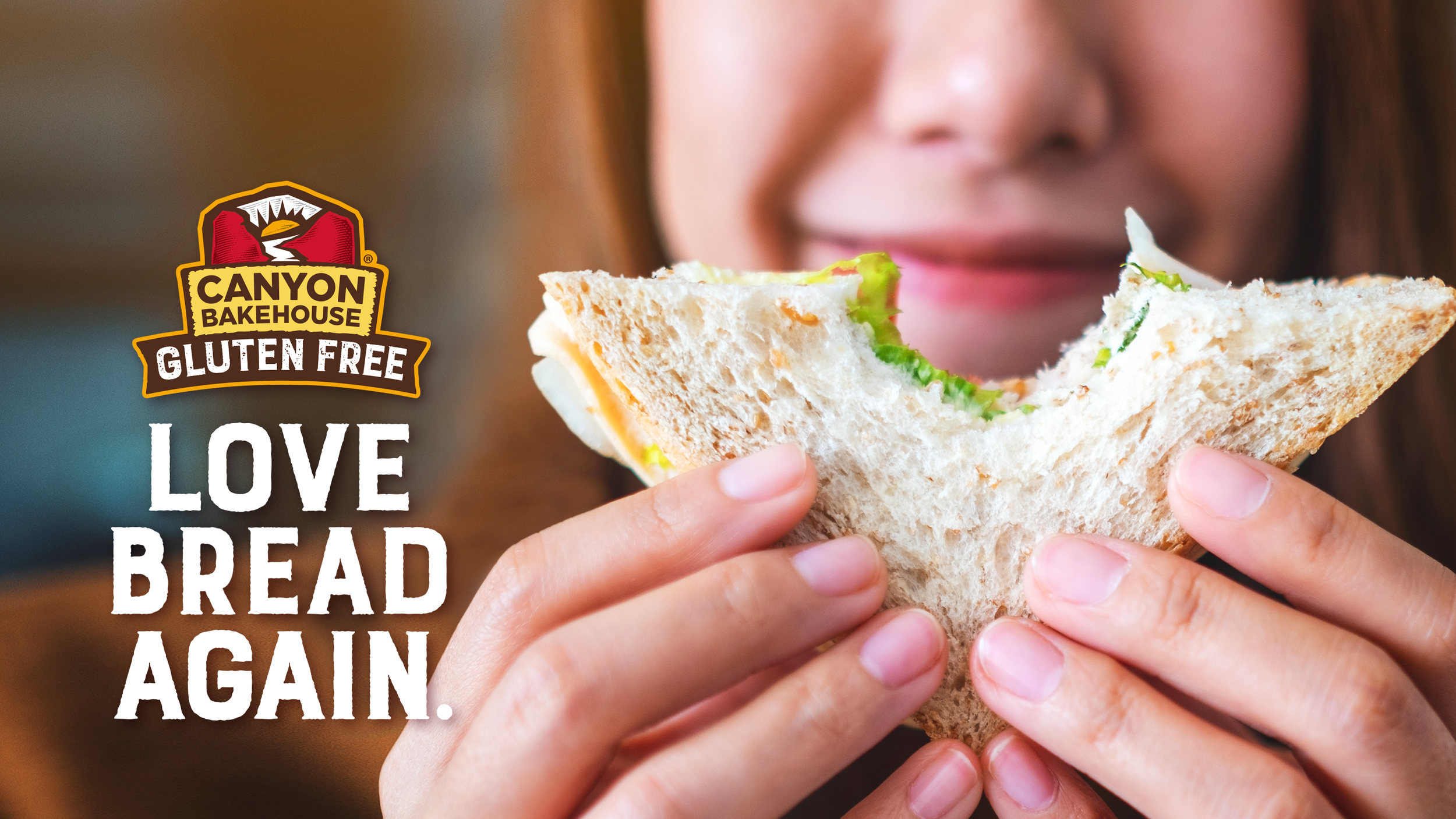
Reinventing gluten-free without compromise
-
Canyon Bakehouse built its reputation on the simple mission of making gluten-free products that taste as good as the real thing. But even after a decade of success, gluten-free bread still lacked the fresh appeal of traditional bread, as most options require refrigeration. Canyon Bakehouse products were shelf-stable and looked like real, fresh bread, but the brand’s visual identity wasn’t telling that story loud enough.
The challenge was to update the brand to compete directly with mainstream breads without losing the trust of gluten-free consumers who are shopping primarily for health reasons.
-
We started by simplifying the Canyon Bakehouse brand mark and giving the gluten-free callout the prominence it deserved. Previously, the packaging almost seemed apologetic about being gluten-free; we wanted it to feel like a proud advantage. A stronger, clearer communication hierarchy made it easier for consumers to find their favorite styles and flavors at a glance, whether they were seasoned gluten-free shoppers or first-time buyers.
Most importantly, we left as much of the packaging surface uncovered as possible to let the bread itself shine through. Unlike many gluten-free competitors, Canyon Bakehouse bread looks hearty and appetizing, and we wanted consumers to make that emotional connection immediately on the shelf.
With a fresher, bolder presence, Canyon Bakehouse is helping gluten-free consumers love bread again without the compromise.
SERVICES
Brand Identity Design
Packaging Design
Mechanical Production
Illustration
Brand Guidelines


"Thank you for the hard work you have put into this project. I could not be more pleased with the results, and I am so excited to bring the design strategy to life across all of our consumer-facing touch points.”
Dan Letchinger | SVP of Growth Brands, Flowers Foods


