SeaPak is the catch of the day, every day
-
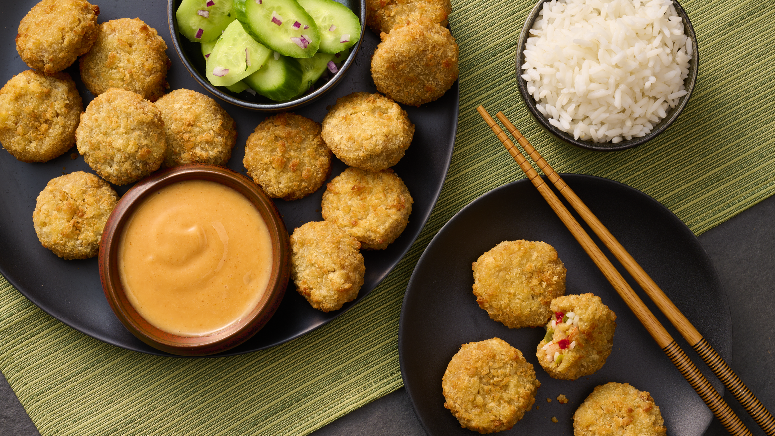
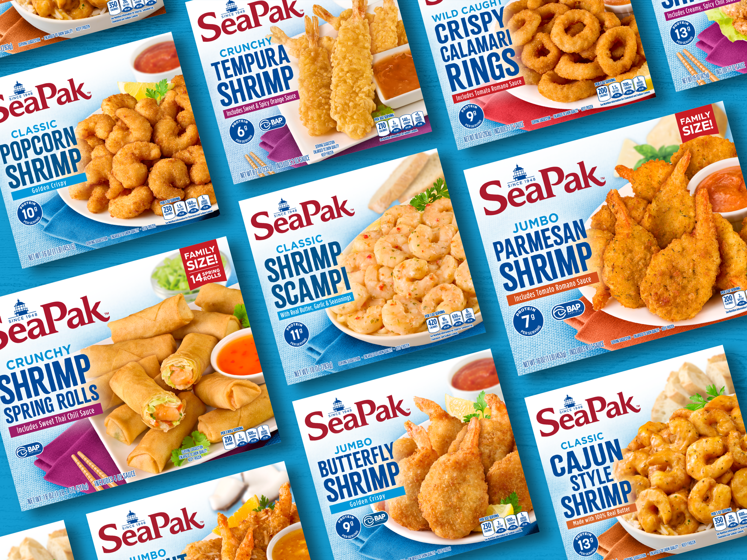
With 75 years of history, SeaPak is America’s leading retail brand in the frozen specialty seafood category. But maintaining your king of the hill status requires a little elbow grease. While the beloved brand is well known for its breaded shrimp, SeaPak sought our help to become an innovator in the space with new, inspired seafood options like salmon burgers, crab cakes, clam strips, calamari rings, and more.
Additionally, the brand wanted to highlight how it’s making mealtimes less stressful and more fun for working families without sacrificing quality and health.
-
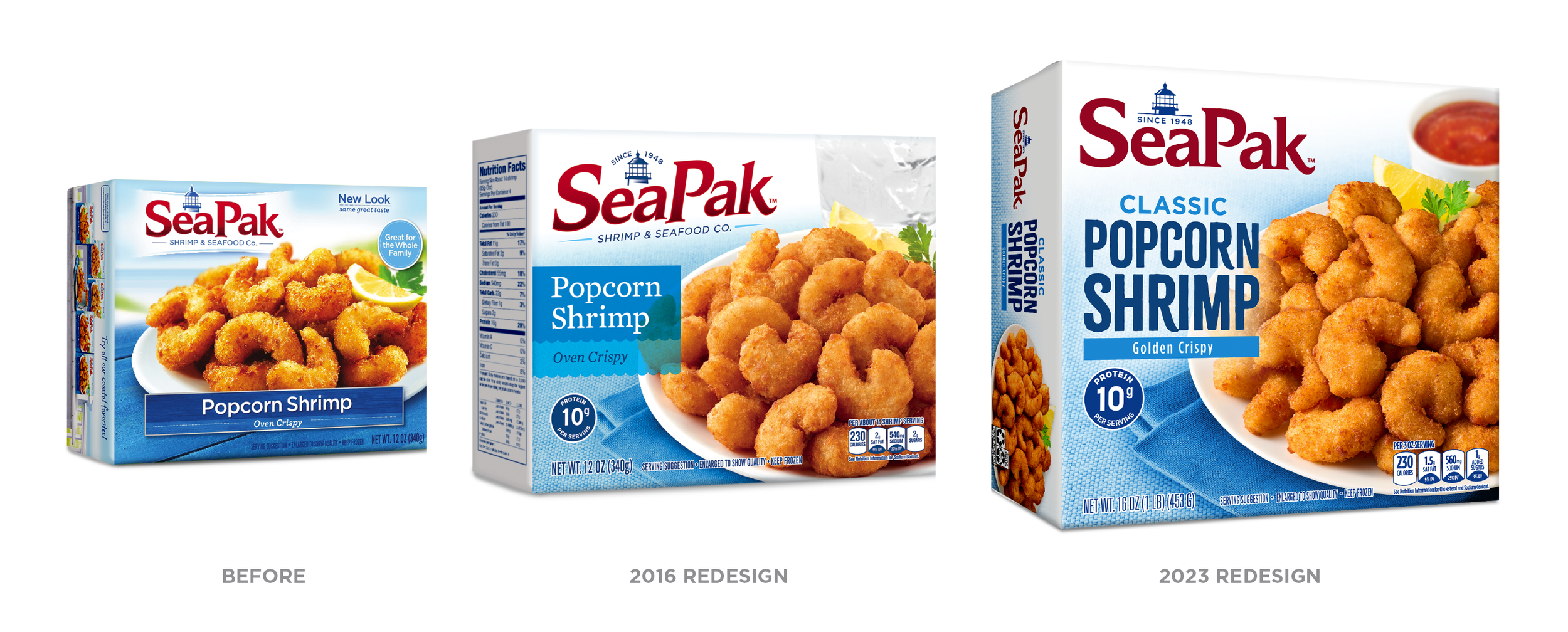
Our relationship with SeaPak goes back to 2016, and we’ve been fortunate to be tasked with redesigning and evolving the brand on two different occasions.
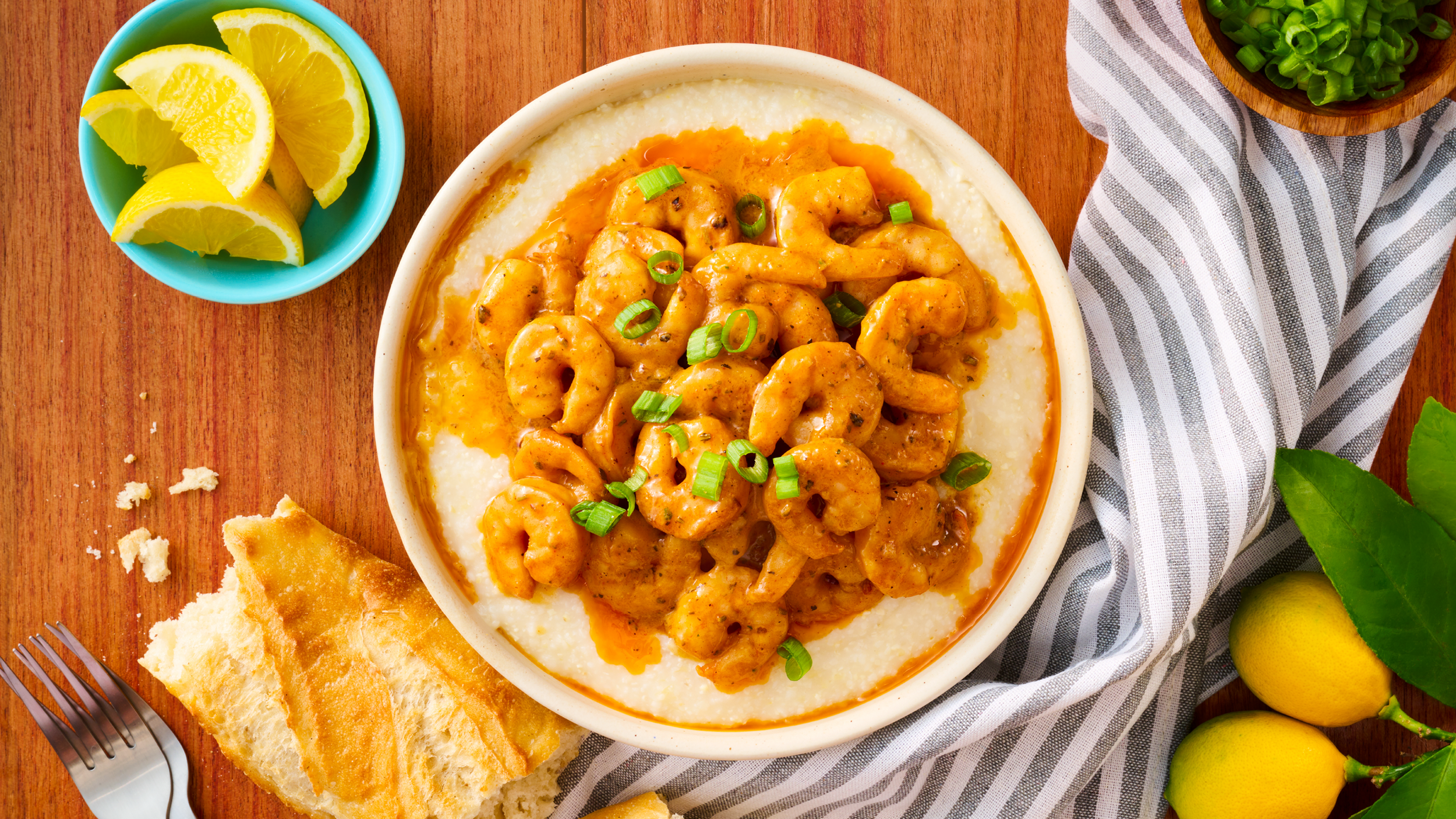
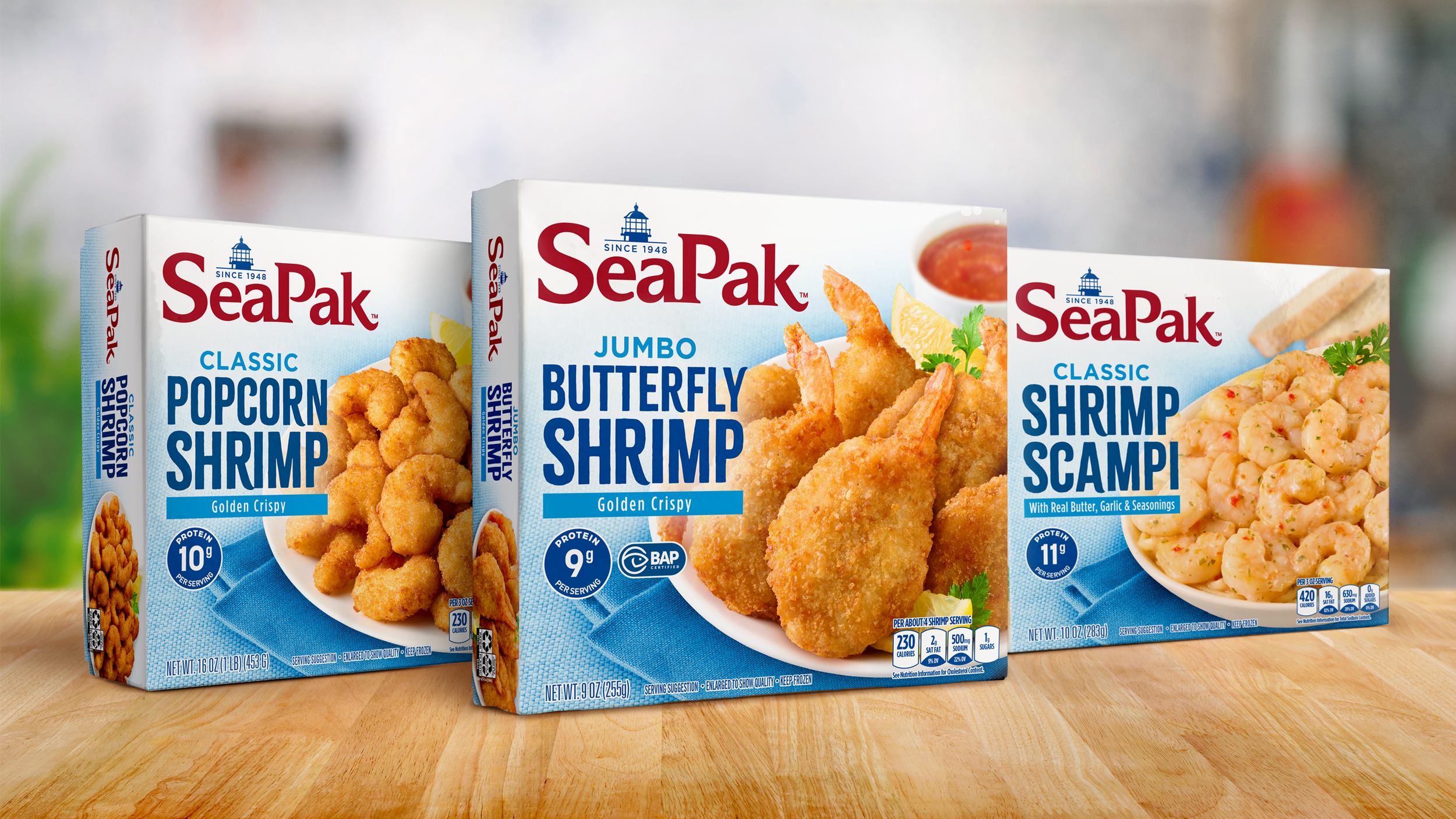
With the first go-round, we were brought in to help shake up the brand. The problem was that everything felt too aspirational, with imagery resembling a pricey lunch out at a seaside location. In reality, the brand was out of touch with its average consumer—they have busy lives, and they’re simply trying to put a healthy, delicious meal on the table. To do that, we primarily focused on appetite appeal by hero-ing the food and creating approachable but delectable imagery. We also updated the logo and added callouts on the packaging to highlight protein content and celebrate the brand’s commitment to sustainability.
Our mission was different in 2023. This time, simplification was the name of the game, as was improving product communication.
We paired down the logo and placed it horizontally. Before, SeaPak was known as a “Shrimp and Seafood Company,” but because the brand spread its wings and released new offerings, that description no longer felt applicable, so we struck it entirely. We also enhanced the brand’s food photography–because SeaPak makes breaded seafood, the products tend to look very similar on shelf. We added side dishes that not only increased flavor appeal but also added pairing suggestions for consumers and showed them how the products could really enhance any meal.
Our approach to both of these redesigns was evolutionary—we maintained the brand’s iconic equities while introducing a packaging architecture system that better communicates the brand’s positioning and streamlines product innovation. While some of these changes may have been minor, they are key enhancements that aid in the brand’s longevity and continued growth.
SERVICES
Brand Identity Design
Packaging Design
Product Innovation
Mechanical Production
Photography Art Direction
Brand Guidelines

“Voicebox has been an incredibly strong partner for many years. From lifestyle and recipe photography, line extension packaging graphics, to total brand overhauls, our graphics have always been significantly impactful to our consumers.”
Ceira Womack | Vice President, Protein CBU, Rich’s