Farmers market to fridge
-
While Dole's "fruit accordion" served the juice brand well, it just wasn't cutting it anymore, and their packaging was getting lost in the juice cooler. Overall, Dole wanted to be modernized while aligning with its updated masterbrand visual identity. Additionally, it needed to maintain recognition and shelf appeal, retaining existing shoppers while also recruiting new ones.
-
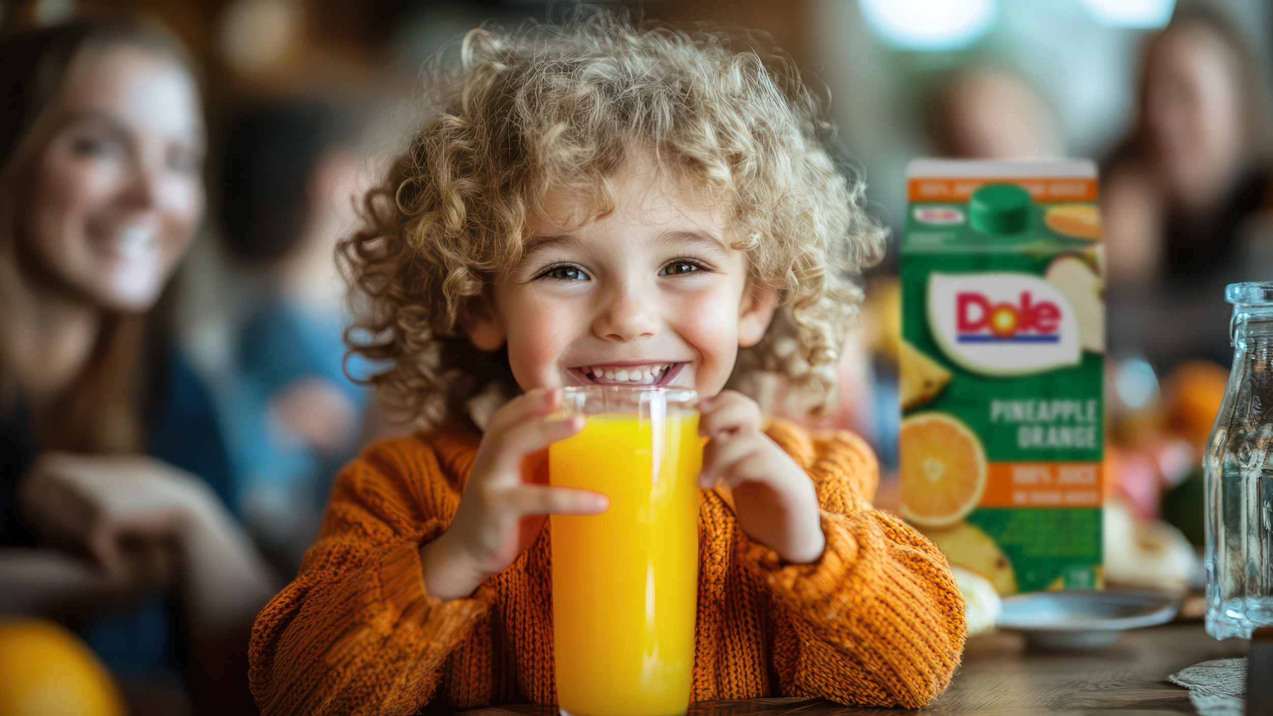
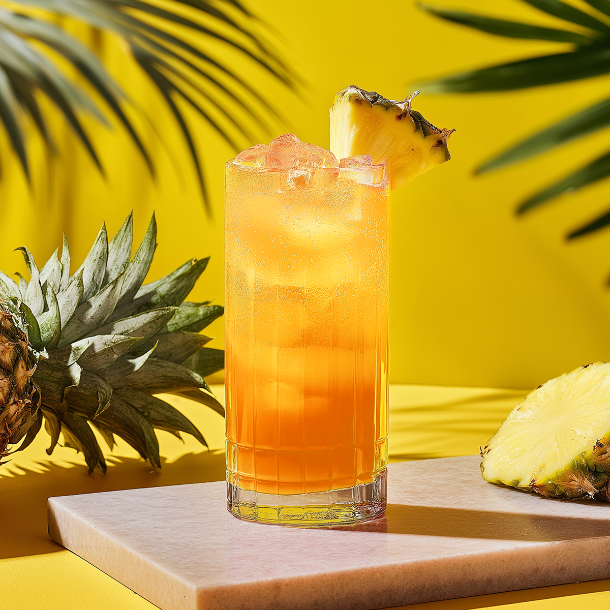
There's nothing like a glass of fresh juice, and that's precisely the energy we wanted to bring. For Dole, that's what it's all about.
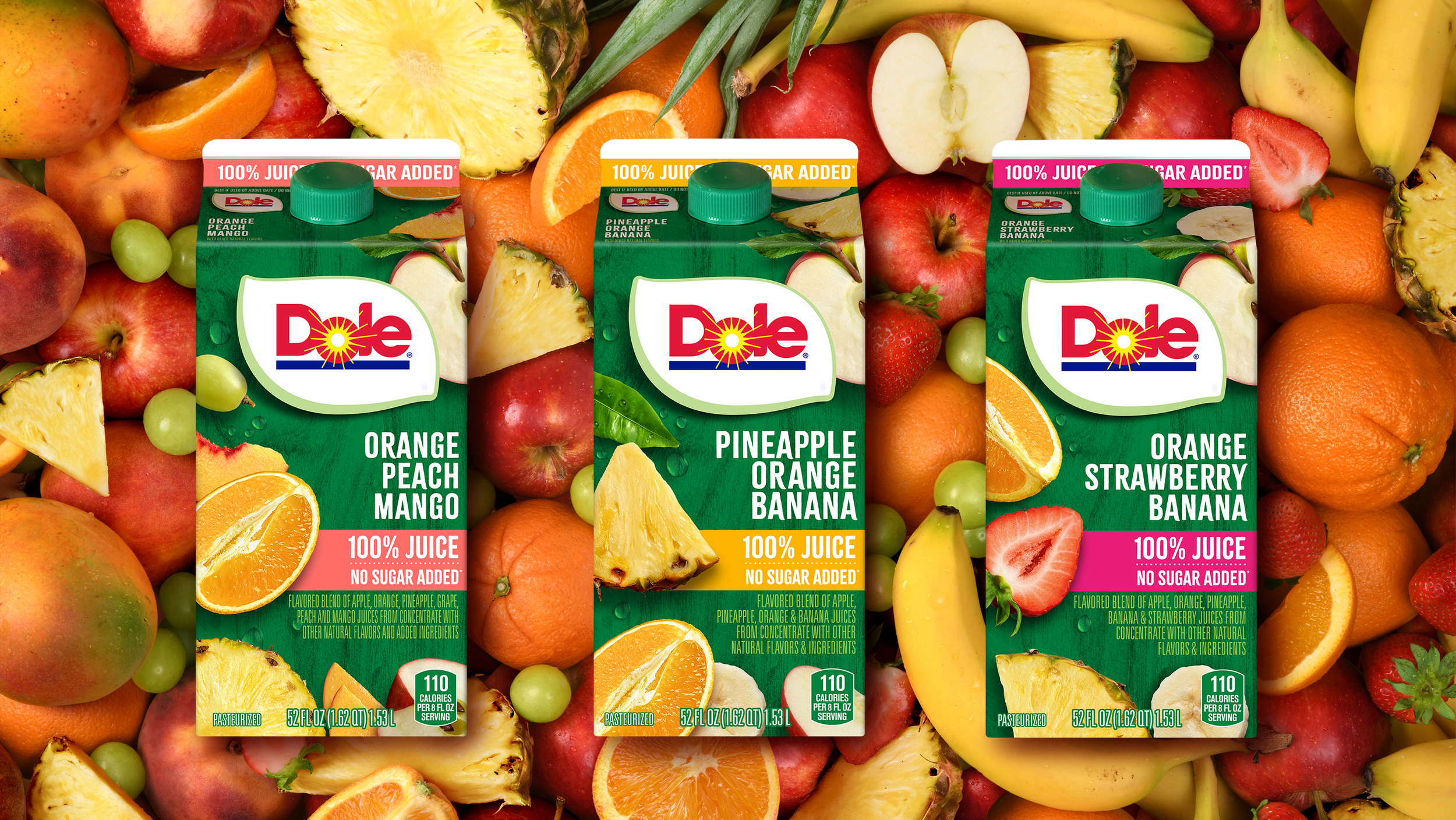
We overhauled their packaging with a farm-friendly, flavor-forward refresh you can drink with your eyes. To communicate that juicy, farmers market feel, we wanted to present fresh-cut fruit laid out like a beautiful smorgasbord, an appetizing visual that aligns with the brand's storied heritage in all things produce. By using a green-wood background similar to a picnic table, we not only gave them an ownable color that pulls away from the pack, but a better canvas for the ingredients inside that speaks to flavor expectations. We also added some strategically placed waterdrops to cue fresh fruit that had just been washed.
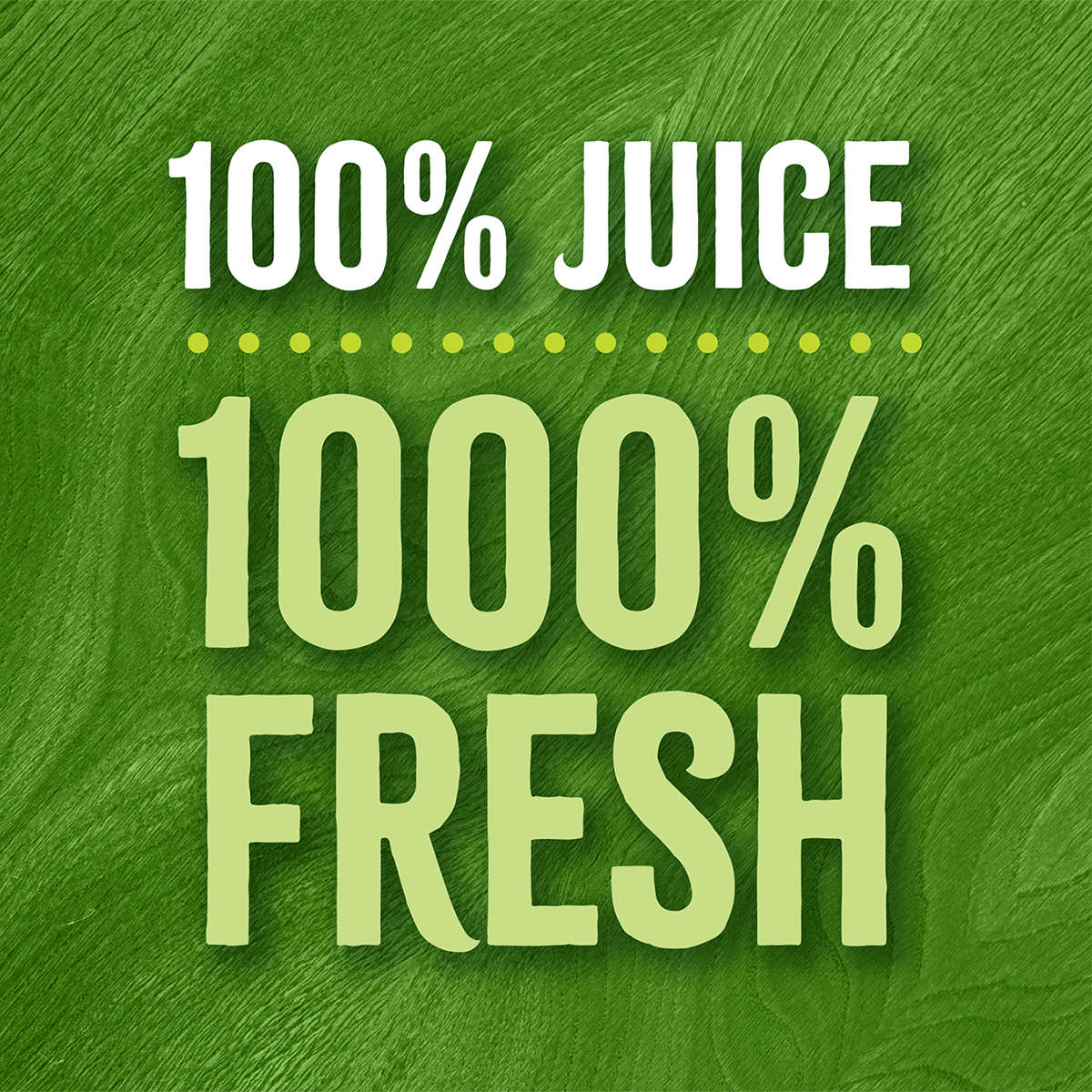
We detached the previous callout from the logo and let it stand on its own, adding a new banner to raise more awareness about its most substantial benefits: no sugar added, no artificial sweeteners, and 100% real juice. The packaging also unfolds cohesively, with a three-sided wrap-around that adds to the table effect and provides nutritional infographics.
With improved wayfinding and brand recognition, the new packaging stands out on the shelf, showcasing fresh fruit and high quality at a good value, encouraging trial amongst a new generation of consumers looking for great taste at an affordable price. Add it all up, and you've got a redesign that's 100% a celebration of farm-fresh fruit, right in your grocery cart.
SERVICES
Brand Architecture
Packaging Design
Mechanical Production
Photography Art Direction